
Seto Catering
Creating Beautiful Experiences
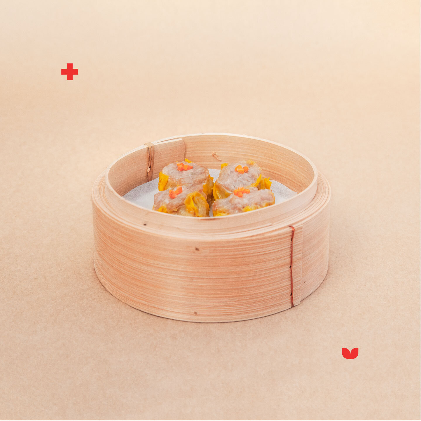
Branding and collateral design for Seto Catering. Through their catering, they aim to bring people together to enjoy beautiful experiences over delicious food. Combining traditional Chinese flavours with fresh local produce to celebrate the best of both worlds.
Logo: Featuring handcrafted lettering, the clean and simple lines of the logo evoke boldness whilst also expressing quality and delicateness; which is reinforced by the contrasting widths of the type. Seto Catering is not just about the food, it is about the entire package and attention to the finer details like sustainable packaging and ‘decor’ that contribute to an experience.
Pattern: Taking inspiration from their Dim Sum offering. The ‘O’ in SETO visually resembles a (tea) leaf and the idea that 点心 (dim sum) translates to ‘touch the heart’. The pattern is formed by combining two ‘O’s together repeatedly, representing the heart and flowers (growth / blossom) - reiterating the idea of people coming together.
Branding
Collateral Design
Pattern Illustration


embossed brochure cover


pattern design


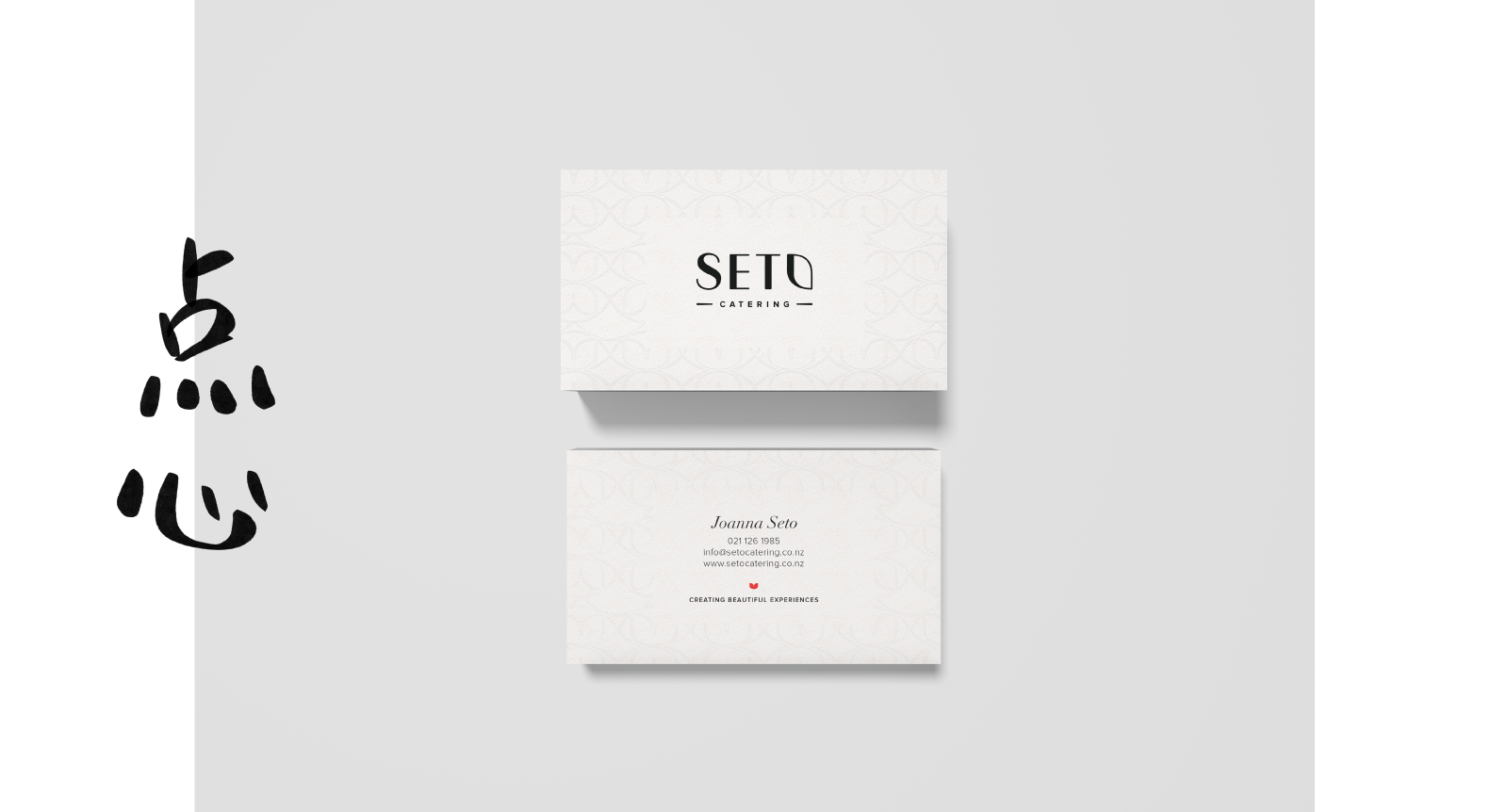
debossed business cards, 300gsm uncoated stock
RELATED PROJECTS